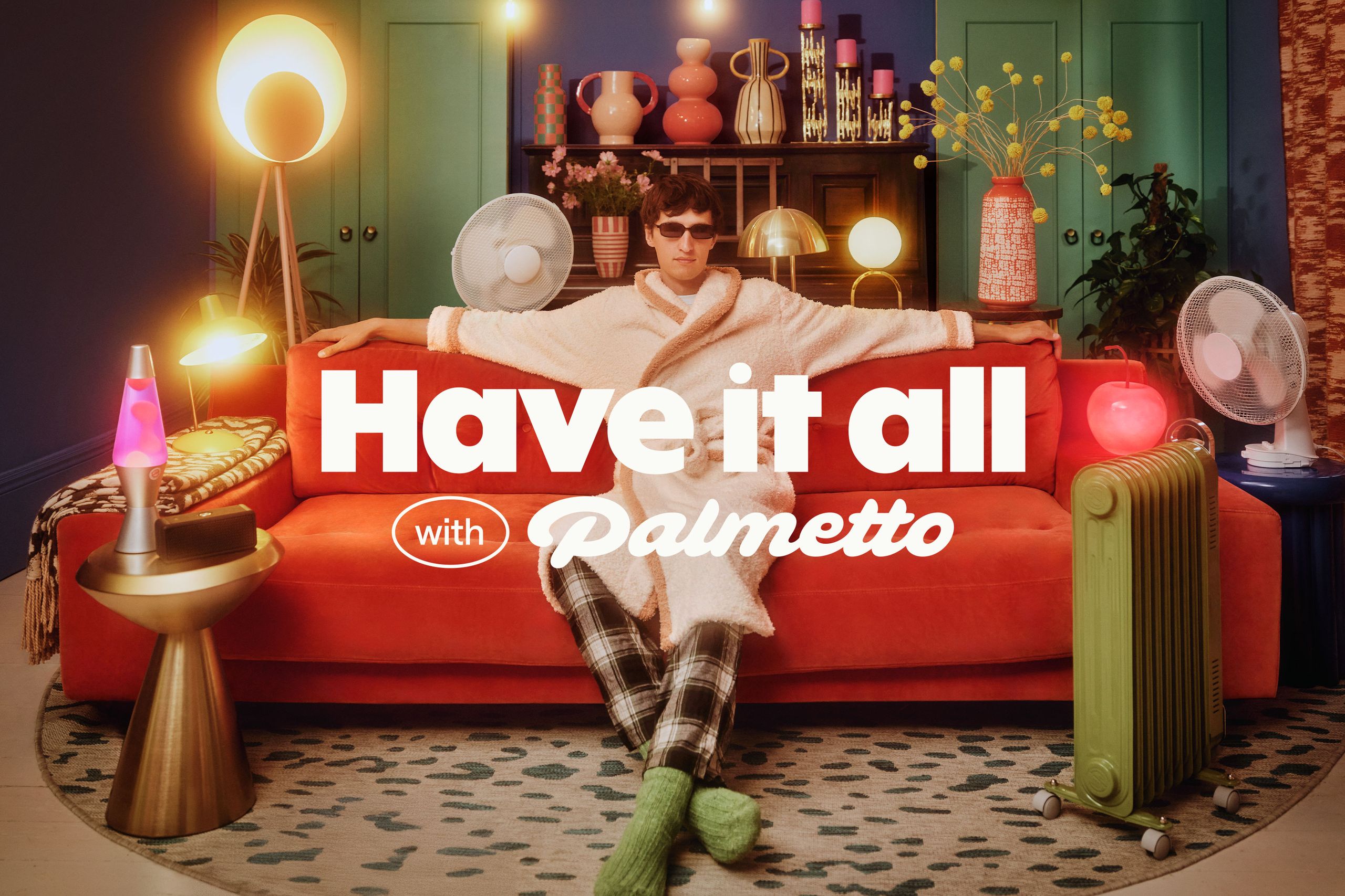
""The category has always leaned on guilt. But guilt only gets you so far," says Ragged Edge's strategy director Christy Madden. "By shifting the story from scarcity to abundance, Palmetto makes renewable energy feel like common sense. Not a cause. Not a compromise.""
""Designing for abundance meant breaking every visual trope of green tech," adds Andrew Kitchener, associate creative director at Ragged Edge. "We needed a system that felt rich, abundant and guilt-free. Presenting a version of clean energy that can cut across political divides. Palmetto makes renewable energy feel like common sense, not a cause.""
Palmetto positions renewable energy as a world of abundance and attainable comfort rather than sacrifice. Ragged Edge built a cozy, stylish identity using a retro-style logotype for warmth and the ABC Solar typeface for confident authority. The brand deliberately avoids typical green tech motifs and the color green, instead embracing a rich, guilt-free visual system. Palmetto's bold, playful brand voice invites customers and frames clean energy as common sense rather than a political cause. The identity aims to appeal across political divides and present renewable energy as simple, comfortable, and desirable.
Read at Creative Bloq
Unable to calculate read time
Collection
[
|
...
]