"Ligatures are subtle typographic details that can quietly elevate a design. They improve spacing, refine rhythm, and add a layer of polish that's often felt more than noticed. When used intentionally, they help turn solid typography into something more considered and expressive.In this Academy article, we'll explore how to use ligatures in Adobe InDesign, Photoshop, and Illustrator, breaking down what they are, why type designers create them, and how different types of ligatures behave across software."
"Basic stuff first. Ligatures are special characters that combine two or more letters into a single glyph. They are commonly used to improve the appearance of letter pairs like fi, fl, ff, or tt, which can look cramped or uneven when typed separately. Many modern typefaces, including ours, include ligatures as part of their character set. You can usually enable them as OpenType features."
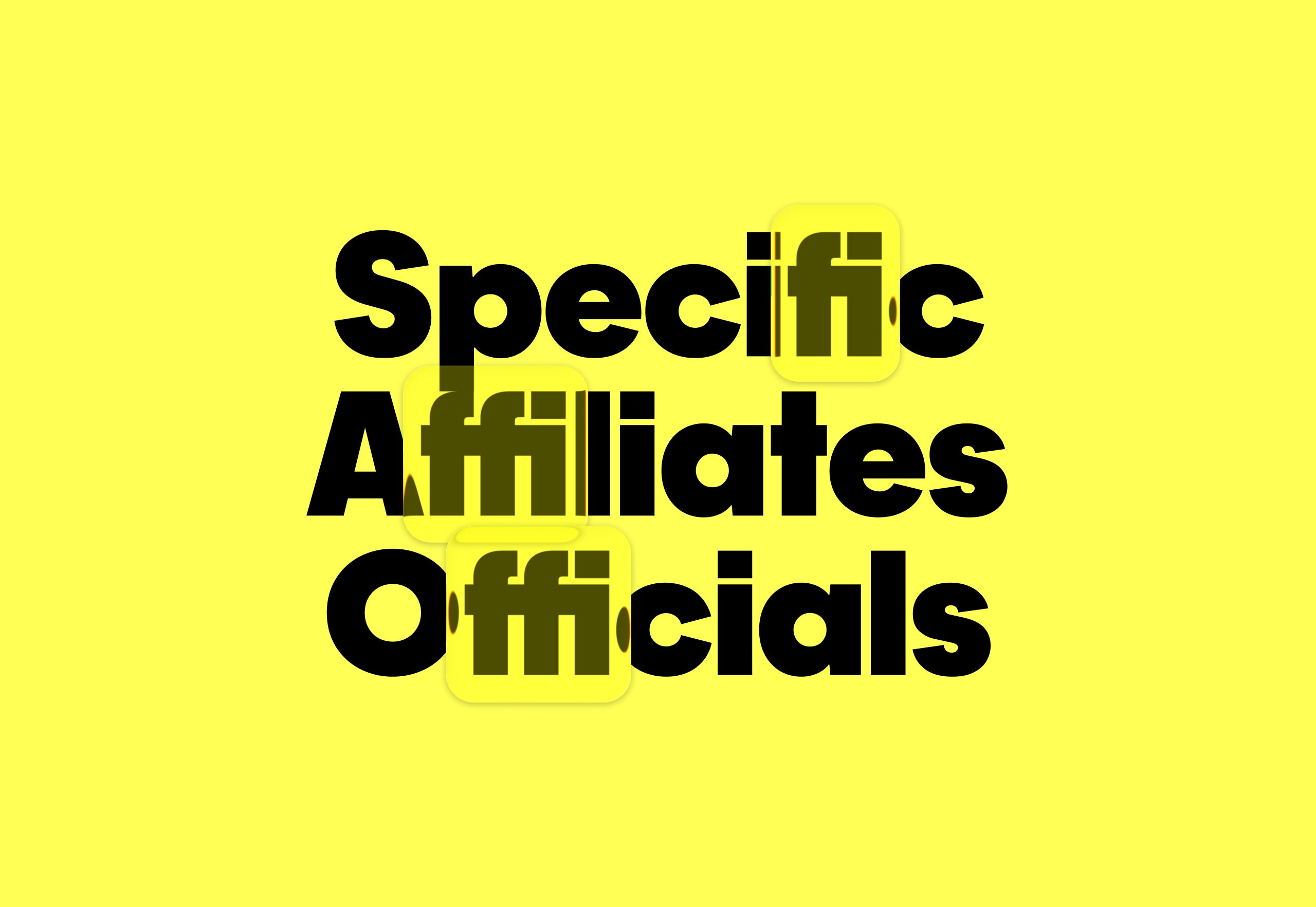
"Here's some terminology to sound knowledgeable when you explain your designs using ligatures. Standard ligatures are practical, readability-focused letter connections that prevent awkward collisions - things like fi, fl, ff, ffi, ffl. They're part of most modern fonts and are usually on by default. Discretionary ligatures are practical, readability-focused letter connections that prevent awkward collisions - things like fi, fl, ff, ffi, ffl. They're part of most modern fonts and are usually on by default."
Ligatures combine two or more letters into a single glyph to improve spacing, rhythm, and visual polish in typography. Standard ligatures address common collisions such as fi, fl, ff, ffi, and ffl and are typically enabled by default in most fonts. Discretionary ligatures provide stylistic connections beyond standard pairs and require deliberate selection. Many modern typefaces include ligatures as OpenType features that can be toggled in design software. Choosing a typeface with ligature support and enabling OpenType options in Adobe InDesign, Photoshop, or Illustrator keeps workflow friction-free and enables intentional, expressive typographic choices.
Read at Pangram Pangram Foundry
Unable to calculate read time
Collection
[
|
...
]