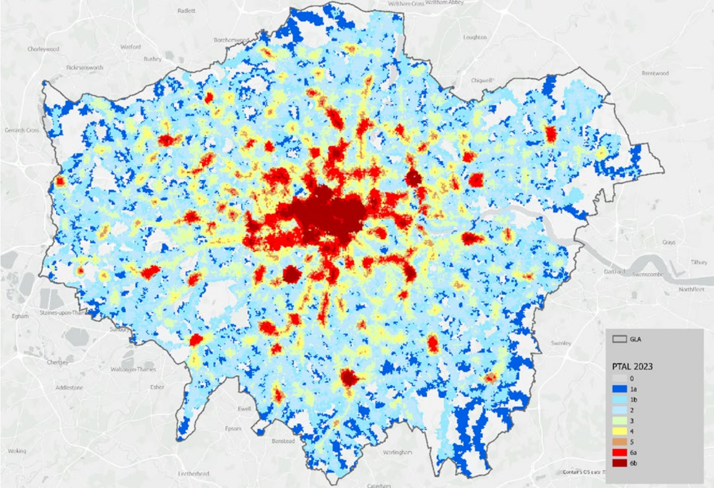
"TfL's huge annual report includes a map that shows the Public Transport Access Level (PTAL) across the city. An area's PTAL is calculated based its proximity to bus, tube, train and tram services and how frequent services are. Each area is graded between zero and 6b, a score of zero indicating very poor access to public transport, and 6b meaning excellent access to public transport, with each score given a different colour."
"As of autumn 2024, which is TfL's most recent data set, 32 per cent of London's population lived in areas with a PTAL connectivity score of four or above. That's ever so slightly lower than the 33 percent in autumn 2023. TfL's report said: 'This reduction in part reflects some reduction to bus services, but also some methodological improvements to the indicator to improve the spatial precision of PTAL scores in relation to the River Thames.'"
"Unsurprisingly, the city centre and most of inner London is a big fat blob of red. Further out most of the map is blue or grey but places like Croydon, Romford and Kingston-upon-Thames, which are all on on major railway lines, are coloured red. Harrow, which is served by the Bakerloo line, Metropolitan line, Piccadilly line and Lioness line, and Wembley, which is served by the Bakerloo, Jubilee, Metropolitan and Lioness lines and Chiltern Railways are both in the red too."
Public Transport Access Level (PTAL) maps show accessibility based on proximity to buses, tube, train and tram services and frequency. Areas receive scores from zero to 6b, where zero indicates very poor access and 6b indicates excellent access, with colors from blue/grey to dark red. Central and most inner London score highly, while much of outer London scores poorly, though railway-linked suburbs such as Croydon, Romford and Kingston-upon-Thames also score highly. Harrow and Wembley are well connected by multiple Underground and rail lines. As of autumn 2024, 32% of Londoners lived in areas with PTAL four or above, slightly down from 33% in 2023 due to some bus reductions and methodological adjustments; buses now move at an average of 9.17.
Read at Time Out London
Unable to calculate read time
Collection
[
|
...
]