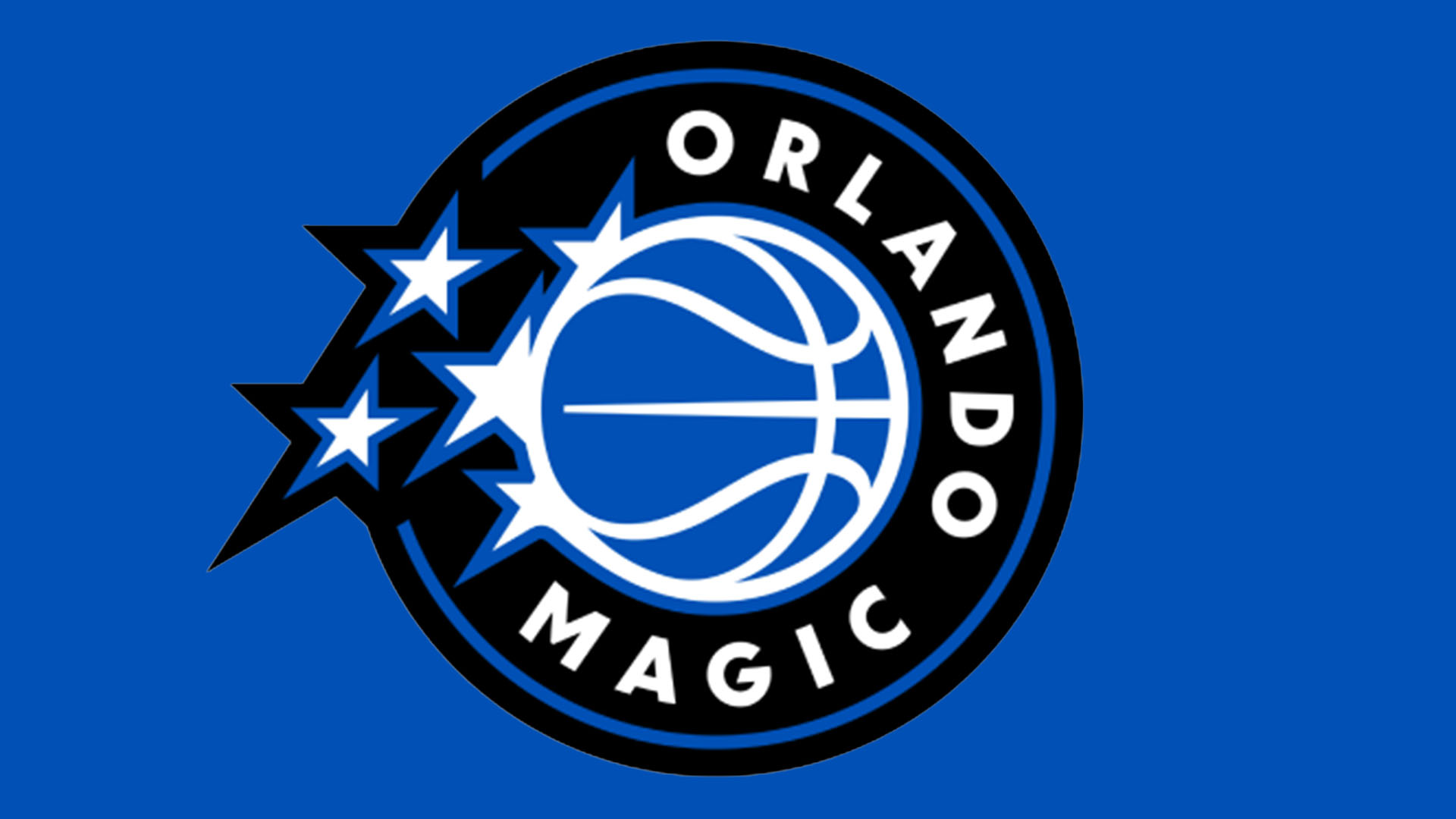
"The backlash to the Orlando Magic's new identity only reinforces how important it is to carve a unique identity in the sporting sphere. Fans want their sports team to feel authentic - something that can't be achieved with trend-driven modern design."
"Despite this being the first update to the team's look in 14 years, the visual revamp has divided fans, with many disappointed by the 'safe' design."
The Orlando Magic recently revealed a new identity including jerseys, court design, and a logo, their first update in 14 years. However, fan reactions have been mixed, with many expressing disappointment at what they perceive as a 'safe' design. Critics highlight the importance of a unique sports identity, arguing that the new logo, which features a simple basketball motif and corporate font, lacks the character that fans desire. The response reflects the challenge of modernizing team branding while maintaining authenticity.
Read at Creative Bloq
Unable to calculate read time
Collection
[
|
...
]