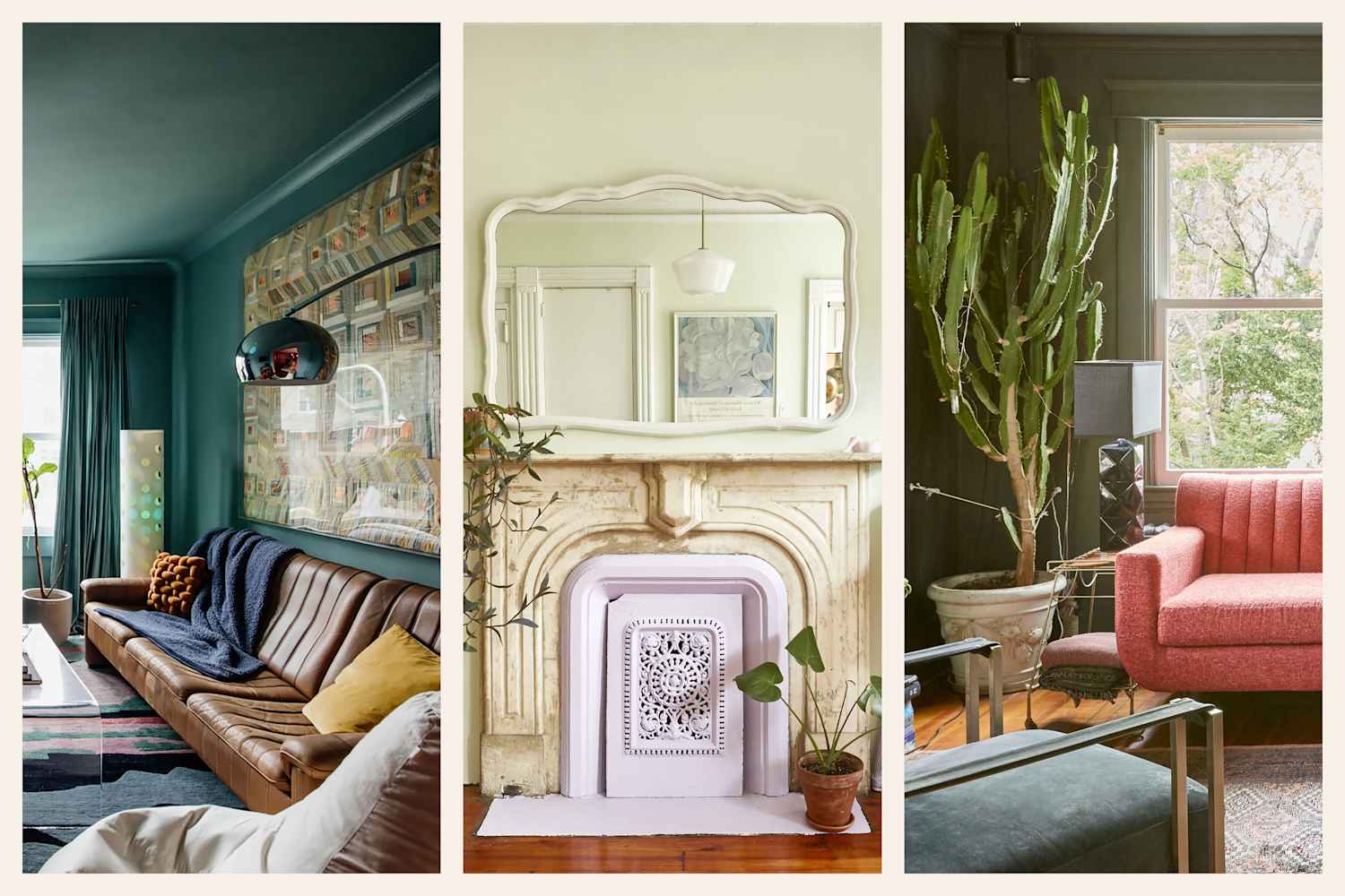
"Of all the colors in the rainbow, green is always my first suggestion to anyone who wants to bring bold color into their home - but doesn't know where to start. Why? It's a cozy shade that's easy to warm up to, thanks to its ties to nature; it tends to bring feel-good energy into any space. What makes it even better, though, is its versatility once you start pairing it with other shades - from cool, calming palettes to bold, blue-green mixes, it's a color that just works."
"I think it really comes down to shade: Rust, coral, and terracotta feel earthy and elevated, while a moodier shade like burgundy can add richness without tipping into seasonal tropes. That's the flexibility that makes green such an approachable entryway option - it works whether you want to play it safe or take a more experimental approach."
"The most common color palette request I get is for a blend of neutrals, plus green. Neutrals are classic but have been trending for so long now that people want to add a little color, and green feels like it's part of the neutral family because it's so common in nature."
Green functions as a cozy, nature-connected hue that brings feel-good energy and adapts across color schemes from cool, calming palettes to bold blue-green mixes. Shade selection defines mood: rust, coral, and terracotta produce earthy, elevated warmth, while burgundy introduces richness without invoking seasonal clichés. Green pairs naturally with neutrals and can act like a near-neutral due to its omnipresence in nature. The color suits both cautious and experimental approaches, making it an approachable option for entryways and whole rooms. Practical inspiration includes 25 real-life color combinations from house tours and interior designer projects.
Read at Apartment Therapy
Unable to calculate read time
Collection
[
|
...
]