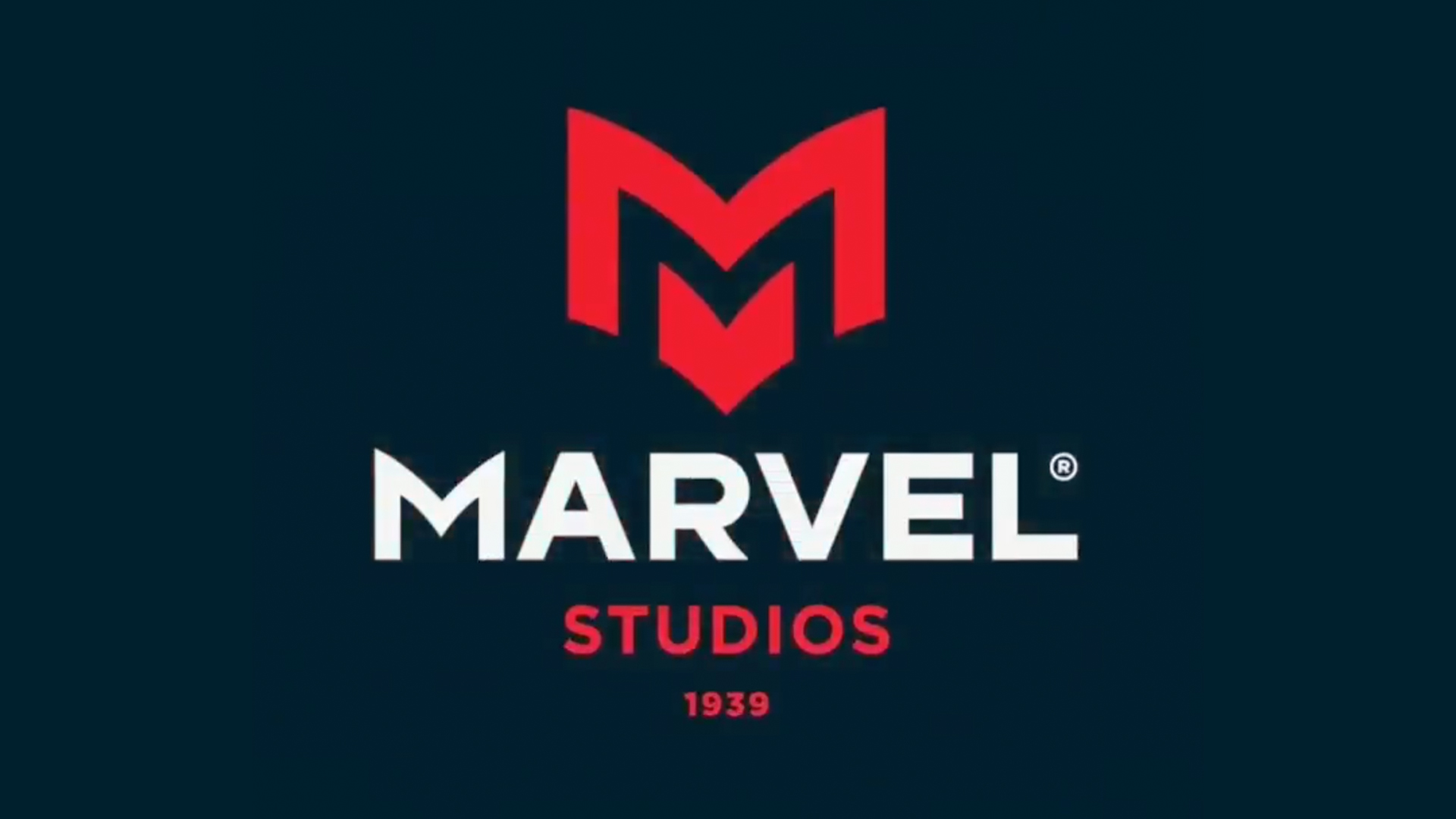
"Marvel is a loved brand however I saw room for improvement with the logo itself. It is currently is lacking a story and it has no brand mark making so it doesn't reduce well."
"When you see the red rectangle with white text in the corner of your eye or as a tab on a comic book it's instantly marvel - you've lost all of that with a generic logo."
"It feels so... corporate. Almost sterile. Doesn't lend to the dynamic and imaginative nature of comics."
Allan Peters attempted to redesign the logo of Marvel, a brand with a massive fanbase. The original logo, valued for its simplicity and boldness, inspired Peters to create a new graphic approach, influenced by comic book aesthetics. His reimagining aimed to provide a richer story and brand mark. However, the redesign faced backlash from fans who felt the new logo appeared too generic and lacked the uniqueness associated with Marvel, leading to a heated debate on its merits and overall identity.
Read at Creative Bloq
Unable to calculate read time
Collection
[
|
...
]