#industrial-design
#industrial-design
[ follow ]
#product-design #furniture-design #design #desk-accessories #sustainability #smartphone-design #ergonomics
Design
fromYanko Design - Modern Industrial Design News
1 day agoAlberto Essesi Just Designed the Lamp That Celebrates Mistakes - Yanko Design
A hanging lamp inverts expected lighting by making the rod glow while a chrome globe at the bottom reflects warm light, turning installation mistakes into elegant humor.
Wearables
fromYanko Design - Modern Industrial Design News
1 day agoThis 4-in-1 Hands-free Flashlight Clips To Clothes, Snaps to Your Phone, and Stands on Its Own - Yanko Design
SparkO earned design and crowd validation by delivering a compact, wearable flashlight with versatile mounting, strong specs, and low purchase friction.


#product-design


Startup companies
fromInc
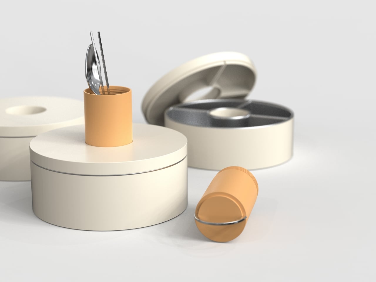
1 month agoInside the DesignObsessed Strategy Driving Cadence's 50-Percent Repeat Sales Rate
Cadence creates premium magnetic containers and organizers that seamlessly integrate into daily life while maintaining aesthetic appeal and sustainability through meticulous industrial design.

UX design
fromYanko Design - Modern Industrial Design News
1 month agoA Student Made the Most Honest Chair of the Year - Yanko Design
Manuela Hirschfeld's Tilt chair uses simple physics and bent plywood to shift between upright sitting and reclined lounging modes without mechanical parts or instructions.
Typography
fromYanko Design - Modern Industrial Design News
2 months agoThis Laptop Stays Cool by Asking You to Move Your Own Keyboard - Yanko Design
Inventec's VeilBook concept improves thermal performance in ultra-thin laptops by using a detachable, repositionable keyboard that unobstructs airflow rather than redesigning materials.
Wearables
fromdesignboom | architecture & design magazine
2 months agoair pressure gauges and mixing consoles inspire the design of otsuka lotec's watch no 8
Otsuka Lotec's No 8 watch features innovative jumping hour and retrograde minute indicators inspired by air pressure gauges and mixing consoles, designed by car designer Jiro Katayama.
Gadgets
fromYanko Design - Modern Industrial Design News
2 months agoNothing Headphone (a) promises flagship-level features and five-day battery life at budget price - Yanko Design
Nothing Headphone (a) delivers flagship features including adaptive ANC, Hi-Res audio support, and customizable sound at an affordable $199 price point.
#smartphone-design


Mobile UX
fromYanko Design - Modern Industrial Design News
2 months agoInfinix and Pininfarina Phone: Flush Camera, Hidden Display - Yanko Design
Infinix NOTE 60 Ultra eliminates camera bumps by integrating triple cameras, notification display, and lighting into a flush glass surface using Uni-Chassis Cam Module design inspired by Ferrari monocoque engineering.
Gadgets
fromYanko Design - Modern Industrial Design News
2 months agoA 6mm 5,000 mAh Power Bank: Xiaomi Built One Thinner Than Any Phone - Yanko Design
Xiaomi's UltraThin Magnetic Power Bank 5000 achieves 6mm thickness and 98-gram weight through silicon-carbon battery technology, delivering practical wireless charging in an exceptionally slim form factor.
fromYanko Design - Modern Industrial Design News
2 months agoWhat If Artists Designed Wi-Fi Routers? - Yanko Design
The router, by virtue of how it works, HAS to be kept in an open environment so it can broadcast the Wi-fi signal everywhere efficiently. That being said, hardly any companies actually spend time thinking about how home-based Wi-fi should look. Companies like Google and Apple worked fairly hard to ensure their smart speakers fit well into interior spaces, but your router is still this alien-looking device with angular forms, black plastic, blinking lights, and antennas shooting out in every direction.
Design
fromYanko Design - Modern Industrial Design News
2 months agoPocket-sized Unix UX-1519 NEOM power bank is your reliable go to gadget - Yanko Design
The Unix UX-1519 NEOM power bank is different as it takes industrial design into the mix of solid functionality, often customary to a battery bank. The 10,000mAh battery bank for your power-hungry gadgets delivers 22.5W fast charging for compatible devices, never letting you down when on-the-go.
Gadgets
fromYanko Design - Modern Industrial Design News
2 months agoThe Vintage Apple Computer That Belongs on Every Tech Lover's Shelf, in LEGO Form - Yanko Design
The result, shaped by industrial designer Jerry Manock and powered by Wozniak's engineering genius, was the Apple II: a smooth, warm-beige enclosure that suggested domesticity rather than machinery. It belonged on a desk the way a telephone did. That calculated approachability helped sell millions of units across sixteen years of production.
Apple

Gadgets
fromYanko Design - Modern Industrial Design News
2 months agoGorgeous Audio-Technica Turntable Concept is worthy of being in an Art Gallery - Yanko Design
A family of sculptural, T-shaped extrusion turntables reimagines vinyl playback as modern collectible objects in tabletop, wall-mounted, and vertical formats.
fromYanko Design - Modern Industrial Design News
2 months agoWhen Light Learns to Dance: A Sculpture That Moves on Purpose - Yanko Design
There's something mesmerizing about watching objects move with intention. Not random chaos or frantic spinning, but deliberate, mechanical motion that feels almost choreographed. Kutarq Studio's Totem de Luz captures that magic perfectly. It's a kinetic lighting sculpture that sits somewhere between functional lamp and art installation, refusing to pick a lane and somehow being better for it. At first glance, Totem de Luz looks like a sleek vertical column made from stainless steel and glass.
Design
Gadgets
fromYanko Design - Modern Industrial Design News
2 months agoBenks' $40 Kevlar Case for iPhone 17 Pro Max Features Hand-Woven Horse Patterns for Lunar New Year - Yanko Design
Knight ArmorAir iPhone case uses dyed 1000D DuPont Kevlar for slim, aerospace-grade protection combined with a burgundy horse motif and rose-gold accents.
fromYanko Design - Modern Industrial Design News
2 months agoA Typewriter-Inspired Calculator in Vibrant Coral Red Just Stole Our Heart - Yanko Design
At first glance, the GIA looks like it time-traveled from a 1960s Italian design studio, stopped briefly in 2026 to pick up some modern tech, and landed on your desk with a personality. The inspiration comes from Olivetti typewriters, those gorgeous mechanical machines that made office work feel like an art form. Remember when tools had character? When objects didn't just function but made you feel something? That's what Bedrina is tapping into here.
Design
Design
fromdesignboom | architecture & design magazine
2 months agostainless steel and concrete build futuristic backdrop for tbilisi flower shop and cafe
A monochromatic industrial interior in Tbilisi uses stainless steel, concrete, and marble to frame a cafe and flower shop, emphasizing reflective surfaces and sensory contrast.

fromEngadget
3 months agoInside Ferrari's Luce EV: The Jony Ive interior is here
Since Apple finally put its mysterious and long-suffering Project Titan out to pasture, we've wondered what a Jony Ive-designed Apple Car might have looked like. Today, we might have a clue. This, though, is no Apple Car. It's the Ferrari Luce ("light" in Italian), the actual name for the EV formerly known as Elettrica, and I'm fresh from getting a walkthrough of the thing from Sir Ive himself. At a glance things look like you might have expected, but there are a few surprises here.
Cars
fromYanko Design - Modern Industrial Design News
3 months agoAI Mini PCs Don't Need to Hide: This One's a Sci-Fi Pyramid - Yanko Design
Mini PCs used to be defined by how invisible they could be, small black rectangles tucked behind monitors or under shelves. That made sense when they were just low-power desktops, but feels out of step now that these machines are running models, listening, watching, and routing data. If AI is going to sit on your desk, it might as well look like it belongs there instead of hiding like a piece of infrastructure.
Gadgets
Design
fromdesignboom | architecture & design magazine
3 months agofolding ears and face decorations turn robotic vacuum cleaners into small pet helpers
Petokka is a non-invasive decorative accessory that attaches to robotic vacuum cleaners, adding responsive facial and ear elements to personalize appearance without affecting function.
fromInsideHook
3 months agoAudemars Piguet's Best New Release Isn't a Royal Oak
Art Deco, which began to proliferate more broadly following the Paris International Exhibition of Modern Decorative and Industrial Arts, from which it derived its name, called upon ancient Egyptian motifs and futurism in a modality that emphasized geometric shapes, broad use of color and a streamlined (if maximalist) aesthetic. During the 1930s, a lesser-known but decidedly compelling offshoot of Art
Design
Design
fromYanko Design - Modern Industrial Design News
3 months agoWhen Your Speaker Is Also a Statement: The Tresound Mini - Yanko Design
Tresound Mini is a cone-shaped, minimalist desktop Bluetooth speaker prioritizing refined design, brand-product integration, and high-fidelity audio that blends into workspaces.
Gadgets
fromYanko Design - Modern Industrial Design News
3 months ago5 Best Gaming Concepts To Revolutionize Gaming In 2026 - Yanko Design
Gaming hardware now emphasizes thoughtful design, intuitive form factors, and sustainable interaction over raw performance to create more personal, innovative user experiences.
Gadgets
fromYanko Design - Modern Industrial Design News
3 months agoThis Anti-Gravity Humidifier Makes Water Flow Upwards So It Isn't 'Another Boring Appliance' - Yanko Design
The Serena Anti-Gravity Humidifier uses visual persistence and synchronized LED strobes to make water droplets appear to climb upward while serving as a household humidifier.
fromYanko Design - Modern Industrial Design News
3 months agoThis Trolley Stacks and Rotates Like Shipping Containers at a Port - Yanko Design
Most storage furniture sits where you put it, fixed shelves and cabinets that do their job but rarely respond to how space changes during a day. Trolleys help with mobility, but they often feel generic, more utility than character. Harbor 051 is a storage trolley that borrows its logic from a place built entirely around movement and stacking, Busan Port, where containers shift and cranes swing in a constant choreography.
Design
fromYanko Design - Modern Industrial Design News
3 months agoThe Most Addictive EDC Tool of 2026: A $45 Magnetic Fidget Knife You Can't Put Down - Yanko Design
Most utility knives work perfectly fine. They cut boxes, strip packages, slice tape, then disappear into drawers or pockets until the next mundane task arrives. They're functional, reliable, forgettable. The problem isn't that they fail at their job. The problem is they offer nothing beyond the cut itself, no texture or personality, no reason to reach for them when they're not strictly necessary. They exist in a utilitarian void where efficiency trumps experience.
Gadgets
Design
fromYanko Design - Modern Industrial Design News
3 months agoWhen Function Meets Whimsy: Grid Transforms the Umbrella Stand - Yanko Design
A minimalist, geometric umbrella stand transforms a utilitarian object into a playful, sculptural statement that supports umbrellas organically and anchors an entryway.
fromArchDaily
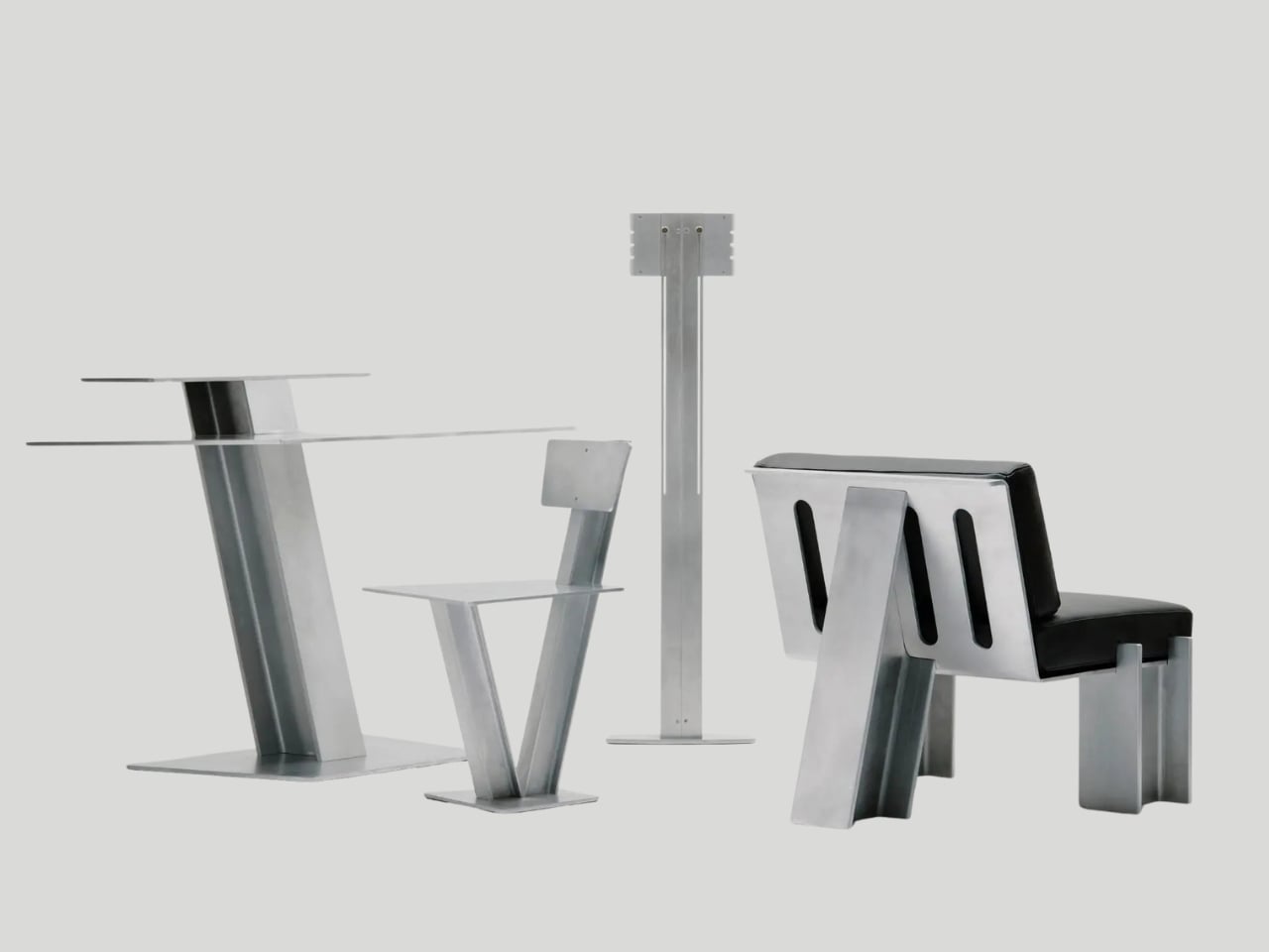
3 months agoFrom Industry to the Living Room: Metal Furniture in Interior Architecture
How did a material conceived for bridges, factories, and large-scale structures make its way to the living room bench, the apartment bookshelf, the café table? For centuries, metal was associated with labor, machinery, and monumentality-from the exposed structures of 19th-century World's Fairs to the productive logic of modern industry. Its presence in domestic interiors is not self-evident but rather a cultural achievement: the transformation of an industrial material into an element of everyday, intimate use, in close proximity to the body.
Design
Gadgets
fromYanko Design - Modern Industrial Design News
3 months agoHuawei Mate X7 Review: When a Foldable Finally Feels Finished - Yanko Design
The Mate X7 combines refined engineering, compact folded dimensions, premium materials, and an invisible hinge to deliver a mature, practical foldable flagship.
Design
fromYanko Design - Modern Industrial Design News
3 months agoThis Nintendo Switch-inspired concept morphs gaming DNA into track performance - Yanko Design
Nintendo's Switch design language is reimagined as the Nintendo Switcher: a low-slung, track-ready concept car blending modular color blocking with motorsport aerodynamics.
UX design
fromYanko Design - Modern Industrial Design News
3 months agoLEDA: The Executive Lamp Where Femininity Meets Power - Yanko Design
LEDA redefines executive desk authority by blending feminine motifs—an eye-like element, swan-inspired neck, and mother-of-pearl luminance—into a balanced, elegant LED table lamp.
fromFast Company
3 months agoWhat 11 top designers want to redesign in 2026
Yes, there are the New Year's traditions of setting ambitious goals and ditching bad habits, but one evergreen resolution that ought to top lists is to banish bad design. Why endure something that simply doesn't work (or is an affront to aesthetics) any longer than we have to? In the spirit of fresh starts, we polled experts in architecture, tech, industrial design, and urbanism on the everyday annoyances and the big-picture issues that they think are in desperate need of a refresh in 2026.
Design
Design
fromdesignboom | architecture & design magazine
4 months agodesigner cara campos recycles worn bicycle frames to craft minimalist furniture
Furniture pieces reuse discarded bicycle frames, preserving structural geometry, visible welds, and surface wear to create chairs, tables, and lamps with minimal new material.
fromYanko Design - Modern Industrial Design News
4 months ago5 Best Transparent Audio Devices That Show What's Inside - Yanko Design
Transparent design has moved beyond gimmick territory into something genuinely compelling. When Nothing started showing off circuit boards through clear plastic, the tech world noticed. Now that aesthetic has matured into a legitimate design movement where form and function create something worth displaying. Audio equipment benefits particularly well from this treatment because the internals actually matter to the listening experience, turning technical components into visual storytelling.
Design
fromYanko Design - Modern Industrial Design News
4 months agoI saw Samsung's 130inch Micro RGB easel TV at CES 2026 and now regular screens feel tiny - Yanko Design
A television spanning 130 inches diagonally creates immediate questions about physics, aesthetics, and whether something this massive can exist as anything other than spectacle. Samsung's answer at CES 2026 involves treating the R95H Micro RGB model as architecture rather than appliances, borrowing design language from gallery easels and luxury retail interiors to create what the company describes as an "extra-large window" that transforms room perception.
Gadgets
fromYanko Design - Modern Industrial Design News
4 months agoThis $1,999 Computer Hides an Entire PC Inside Its Minimal Keyboard - Yanko Design
There's something oddly nostalgic about Caligra's c100 Developer Terminal, yet it feels completely modern at the same time. At first glance, it looks like someone took a pristine keyboard from the early computing era, polished it up, and reimagined it for 2026. But this isn't just a keyboard. It's an entire computer, cleverly disguised as the thing you type on.
Gadgets
fromYanko Design - Modern Industrial Design News
4 months agoRetro-modern N200 desktop speaker has serious Teenage Engineering vibes - Yanko Design
This is the Orgdot N200 Bluetooth desktop speaker that bears a tell-tale industrial design influence and a pinch of steampunk vibe. Designed by Shu Zhang and his team, the wireless speaker is mindful of the design sense of modern users. The primary motive is to create a relaxing and immersive atmosphere for the user, while keeping the practical functionality intact.
Gadgets
Gadgets
fromYanko Design - Modern Industrial Design News
4 months agoACEMAGIC M1A PRO+ Is a Tank-Styled Ryzen AI Cube With 128GB RAM - Yanko Design
A cube-shaped, design-forward mini PC presents performance-focused aesthetics and physical presence, combining AMD Ryzen AI MAX 395 power with sculpted, tank-like industrial styling.
Gadgets
fromYanko Design - Modern Industrial Design News
4 months agoThis CMF Phone Mini Concept Is The Compact Android Fans Have Been Begging For - Yanko Design
A compact, modular smartphone design prioritizes accessibility and practical aesthetics, offering a viable small-phone alternative to discontinued mini flagships.
Cars
fromYanko Design - Modern Industrial Design News
4 months agoThis Blade-Like eVTOL Makes the Cybertruck Look Like A Child's Sketch - Yanko Design
MOSTAVIO's MX1 combines origami-like angular composite surfacing, co-axial rotors, and VR autonomous control to deliver a refined, sculptural flying car design.
fromdesignboom | architecture & design magazine
4 months agovertical turntable VS-01 lets records stand upright as a design object
The VS-01 Vertical Turntable by CoolGeek challenges the traditional layout of record players by rotating vinyl upright, transforming music playback into a visible, spatial event. Conceived as an all-in-one audio system, the design integrates vertical vinyl playback, built-in speakers, and Bluetooth 5.3 connectivity. By exposing the motion of the record, the turntable treats listening as both an auditory and visual act, allowing analog music to occupy space in a more deliberate way.
Gadgets
fromYanko Design - Modern Industrial Design News
4 months agoHow Coca Cola's Benny Lee Is Redefining Industrial Design as Storytelling, Not Just "Making Products" - Yanko Design
Design Mindset steps into episode 16 with a clear purpose: to understand how industrial designers are navigating a world where tools, platforms, and expectations keep shifting under their feet. Yanko Design's weekly podcast, Design Mindset, powered by KeyShot, is less about design celebrity and more about design thinking, unpacking how decisions get made, how stories are built around products, and how technology is reshaping the craft from the inside out.
Design
Gadgets
fromYanko Design - Modern Industrial Design News
4 months agoThis Monument-Inspired Speaker Concept Stands Tall on Your Shelf - Yanko Design
Sonique is a tall, architecture-inspired wireless speaker that emphasizes monument-like aesthetics, subdued controls, and capable battery-powered audio performance.
fromYanko Design - Modern Industrial Design News
4 months agoThis $109 Electric Moka Pot Lives on Your Desk, Not Your Stovetop - Yanko Design
Instead of treating great coffee as a weekend luxury, this little brewer integrates it into your everyday life. Plug it in beside your laptop, fill it with water and fresh grounds, and a few minutes later you have a dense, aromatic moka style coffee that feels closer to a ritual than a chore. This is also in part thanks to its avant-garde Alessi-esque Italian-design form factor. On the hardware front, you've got basic electronics
Coffee
fromYanko Design - Modern Industrial Design News
4 months agoThis $1,299 Heater Costs 75% Less to Run Than Propane - Yanko Design
Look, most patio heaters are basically expensive lawn ornaments that happen to produce a tiny bubble of warmth if you stand directly underneath them while wearing a parka. The Timber Stoves Revere Patio Heater is not that. This American-made beast is more like a seven-foot tall sculpture that moonlights as a radiant heating powerhouse, and honestly, it's about time someone figured out how to make outdoor heating both beautiful and brutally effective.
Gadgets
fromdesignboom | architecture & design magazine
4 months agostudents redefine the human-tech synergy at hongik's annual industrial design degree show
Held from November 3 to 8, 2025, the Department of Industrial Design at Seoul-based Hongik University presented its annual Graduation Exhibition under the theme 'The Use of Uselessness: What If.' Moving beyond conventional purpose-centered design, the exhibition serves as an open dialogue between function, emotion, and culture, challenging students to find creative value in concepts that exist beyond conventional utility.
Design
fromYanko Design - Modern Industrial Design News
5 months agoHuawei Wi Fi 7 Mesh Router Turns Connectivity into Sculptural Lighting - Yanko Design
The main unit rises vertically under a tall transparent dome, and the first impression lands somewhere between illuminated glassware and a miniature architectural model. A sculpted cone sits inside the chamber, channeling warm LED light upward through fine vertical ribs that stretch the glow into elongated streaks. The gradient begins deep amber at the base, fades toward soft cream near the midpoint, and dissolves into near-invisibility at the dome's crown.
Gadgets
Design
fromLondon Business News | Londonlovesbusiness.com
5 months agoTop seven U.S. manufacturers leading the way in industrial design innovation - London Business News | Londonlovesbusiness.com
Human-centred industrial design and technological innovation drive smarter, more usable, sustainable products that bridge concept and production and improve manufacturing efficiency and long-term value.
Gadgets
fromYanko Design - Modern Industrial Design News
5 months agoDJI Meets Polestar in This Sleek White FPV Drone Concept That Rejects the Racing Aesthetic - Yanko Design
Polestar's FPV drone concept transforms racing hardware into a premium, minimalist, automotive-styled product through structural stacking and refined surfacing.
Gadgets
fromYanko Design - Modern Industrial Design News
5 months agoRobosen's TRANSFORMERS Soundwave Does What the 1984 Original Only Pretended: It Actually Works as a Speaker - Yanko Design
Robosen's G1 Flagship Soundwave preserves iconic cassette-player industrial design while delivering functional consumer-robotics features like a Bluetooth speaker and integrated retro tape-controls.
Apple
fromYanko Design - Modern Industrial Design News
5 months agoiPhone Brutal is vibrant, sharp-edged concept you can't look beyond - Yanko Design
A Brutalist dual-screen flip iPhone concept emphasizes bold geometry, modular layers, a rear small display, and a Carl Zeiss–inspired triple-camera array.
Gadgets
fromYanko Design - Modern Industrial Design News
5 months agoFinally, a Lamp That Changes Shape as Often as Your Mood - Yanko Design
MOODI is a modular, reconfigurable stand lamp that snaps together like LEGO, enabling customizable lighting configurations and aesthetic flexibility for changing spaces.
fromYanko Design - Modern Industrial Design News
5 months agoThese 3 Desk Objects Make Shredding, Crushing Feel Like Design - Yanko Design
Many of us already practice tiny acts of destruction when we're stressed. Shredding receipts, crumpling paper, or picking at packaging feel oddly satisfying even though we usually hide them. They're little releases that most designs ignore, treating them as guilty pleasures instead of real human behaviors. Art of Destruction is a concept that leans into those impulses and asks what happens if industrial design treats them as experiences worth designing.
Design
Gadgets
fromYanko Design - Modern Industrial Design News
5 months agoNOVA Cools PCs Without Fans or Spinning Blades, Uses Ion Wind - Yanko Design
NOVA is a fanless PC cooler that sculpts silent airflow using shaped intakes and ion electrodes, replacing spinning fans with minimalist architectural design.
fromYanko Design - Modern Industrial Design News
5 months agoThis Aluminum Sphere Pencil Makes You Draw Like a Caveman - Yanko Design
Early humans scratched lines on stone walls with rocks, and that primal act sits at the root of every sketch we make today. Most modern pencils are optimized for control and detail, shaped like sticks to give you precision over every line and curve. Alberto Essesi's unnamed pencil concept takes a deliberate step back toward that raw, gestural way of drawing, translating it into a highly refined spherical object that looks more like a polished pebble than any conventional pencil.
Design
fromYanko Design - Modern Industrial Design News
6 months agoWorld's Comfiest Mouse looks legitimately ugly... but it somehow works - Yanko Design
I remember being in the third year of design college when I was introduced to this massive book titled "Indian Anthropometric Dimensions." For the uninitiated, this book contained practically all the dimensions of the average (and non-average) Indian person, male and female, old and young. The purpose of such a book was to understand ergonomics numerically, rather than visually. And for designers, this meant adding the ultimate constraint to our wild designs... so humans could actually use them.
UX design
Gadgets
fromYanko Design - Modern Industrial Design News
6 months agoA Rectangular Bladeless Fan? This Design Breaks All the Rules - Yanko Design
A square-based bladeless fan uses a focused duct system and 5D air circulation to deliver more precise, amplified airflow while fitting right-angled interiors.
[ Load more ]