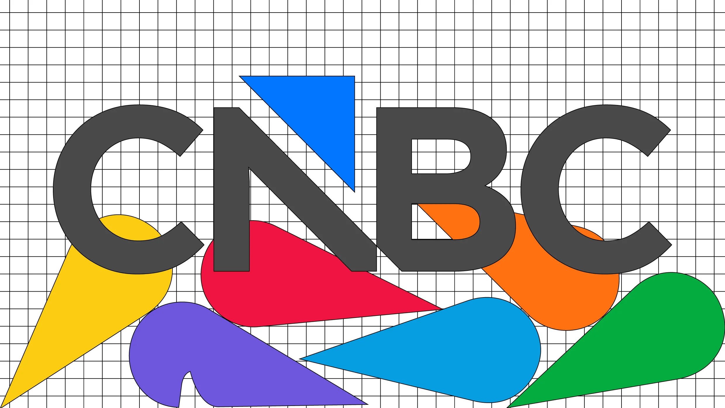
"CNBC and its sister networks, including USA, Golf Channel, and E!, are spinning off from their former parent company Comcast NBCUniversal to form a new publicly traded company called Versant. As part of the new company, some of the brands in the portfolio have to rebrand to get rid of NBC's iconic Peacock mark, CNBC included. CNBC's new logo, which goes live December 13, might take viewers some time to get used to. The financial news network's new logo was designed in house to easily match the preexisting visual assets it uses on air."
"The typography of the mark based is on the network's font, Gotham, and it shows a triangle cutting into the letter N and floating just above the wordmark. That triangle, which the network calls an arrow, matches its on-air graphics package. The triangle shape has been used by CNBC since 2023. It's shown next to stocks to indicate which companies are up in green and which are down in red, and it appears as an icon displayed next to on-air chyrons like "Earnings Report.""
"The new logo is meant to reflect a modern, streamlined identity, CNBC says, but the initial reaction online to the new logo hasn't exactly been positive. In one Reddit thread, complaints ranged from "generic" and "corporate-looking" to being bothered by the triangular notch at the bottom of the N and B. "The triangle represents a guillotine blade, killing the brand," one wrote. On X, a commenter asked if it was a joke."
CNBC and sister networks USA, Golf Channel, and E! are spinning off from Comcast NBCUniversal into a new public company named Versant. Several brands must drop NBC's Peacock mark, and CNBC will debut a new logo on December 13. The new mark uses Gotham typography with a triangular notch that sits above the wordmark and aligns with existing on-air graphics. The triangle has been used since 2023 beside stock indicators and chyrons. The design employs the network's Broadcast Blue and Neon Blue palette and aims for a modern, streamlined identity, but it has prompted negative reactions online.
Read at Fast Company
Unable to calculate read time
Collection
[
|
...
]