#legibility

[ follow ]
#typography
fromwww.nytimes.com
5 hours ago
Typography

Is Times New Roman Better Than Calibri for the State Department?

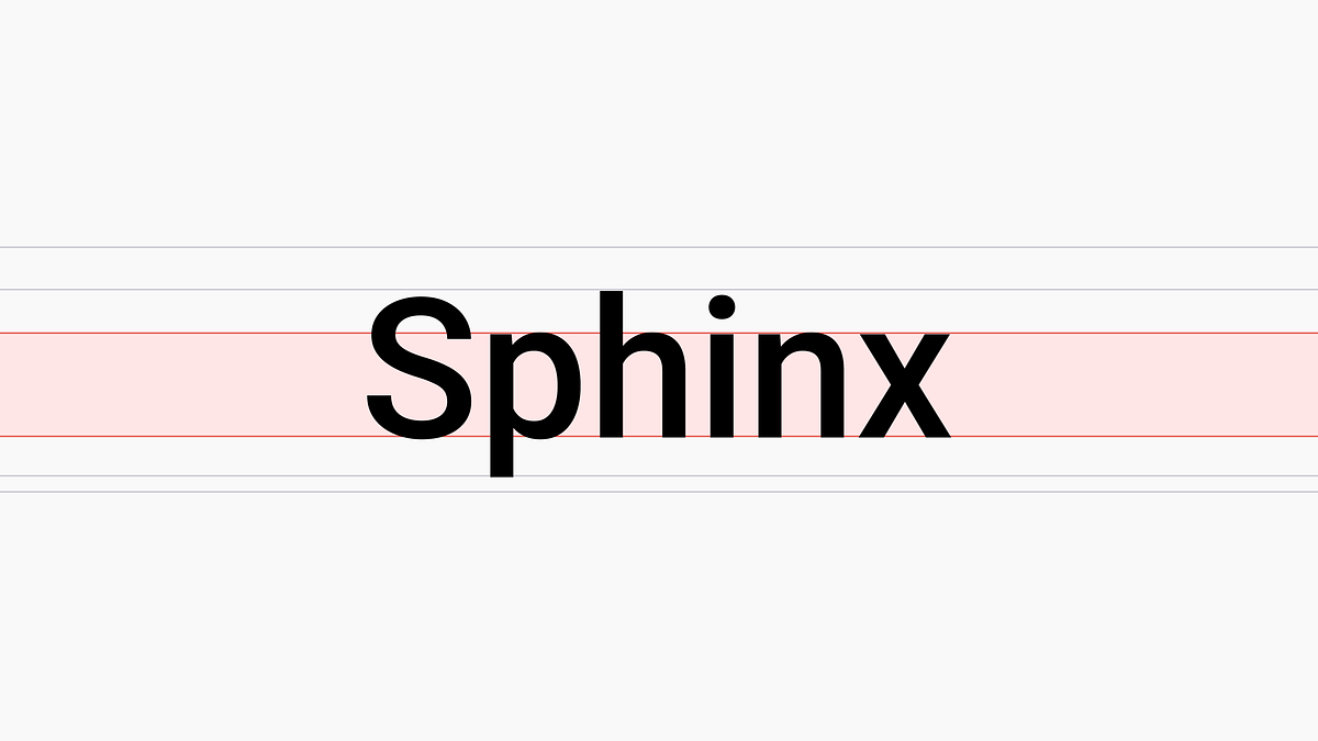
Typeface characteristics like x-height, apertures, crossbar position and serif presence affect legibility; Times New Roman and Calibri differ in these features.
fromMedium
7 months ago
Typography

How to be strategic when picking a typeface

Understanding font metrics like x-height can greatly enhance text legibility on digital devices.
Law
fromAbove the Law
2 months ago

Courts Should Avoid Handwritten Orders - Above the Law

Courts should avoid handwritten orders because they are hard to read, more error-prone, limit content, hinder accessibility and processing.
UX design
fromWIRED
2 months ago

Liquid Glass Could Be One of Apple's Most Divisive System Designs Yet

Apple's Liquid Glass redesign aims for focused, elegant UI but often reduces legibility, hides controls, and creates inconsistent, distracting visuals across devices.
Productivity
fromSeangoedecke
3 months ago

Seeing like a software company

Organizations maximize legibility to control and measure work while relying on essential illegible, tacit activities; prioritizing legibility often reduces efficiency yet remains preferred.
[ Load more ]