fromI Love Typography Ltd
4 months ago10 Must-have Typefaces for 2026 - I Love Typography Ltd
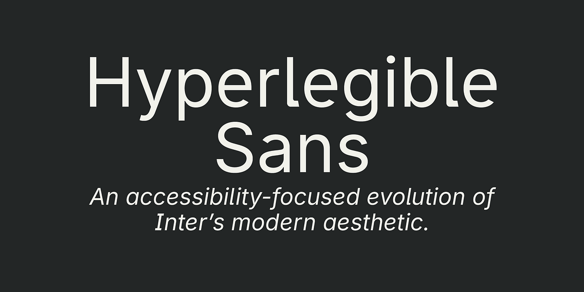
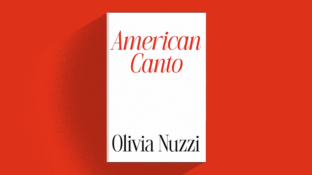
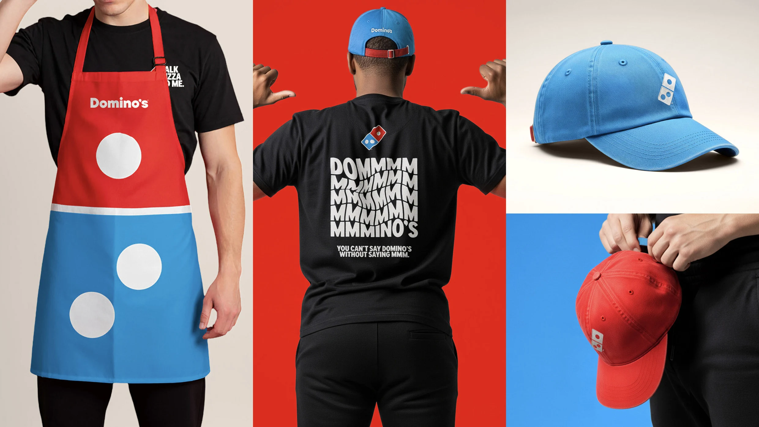
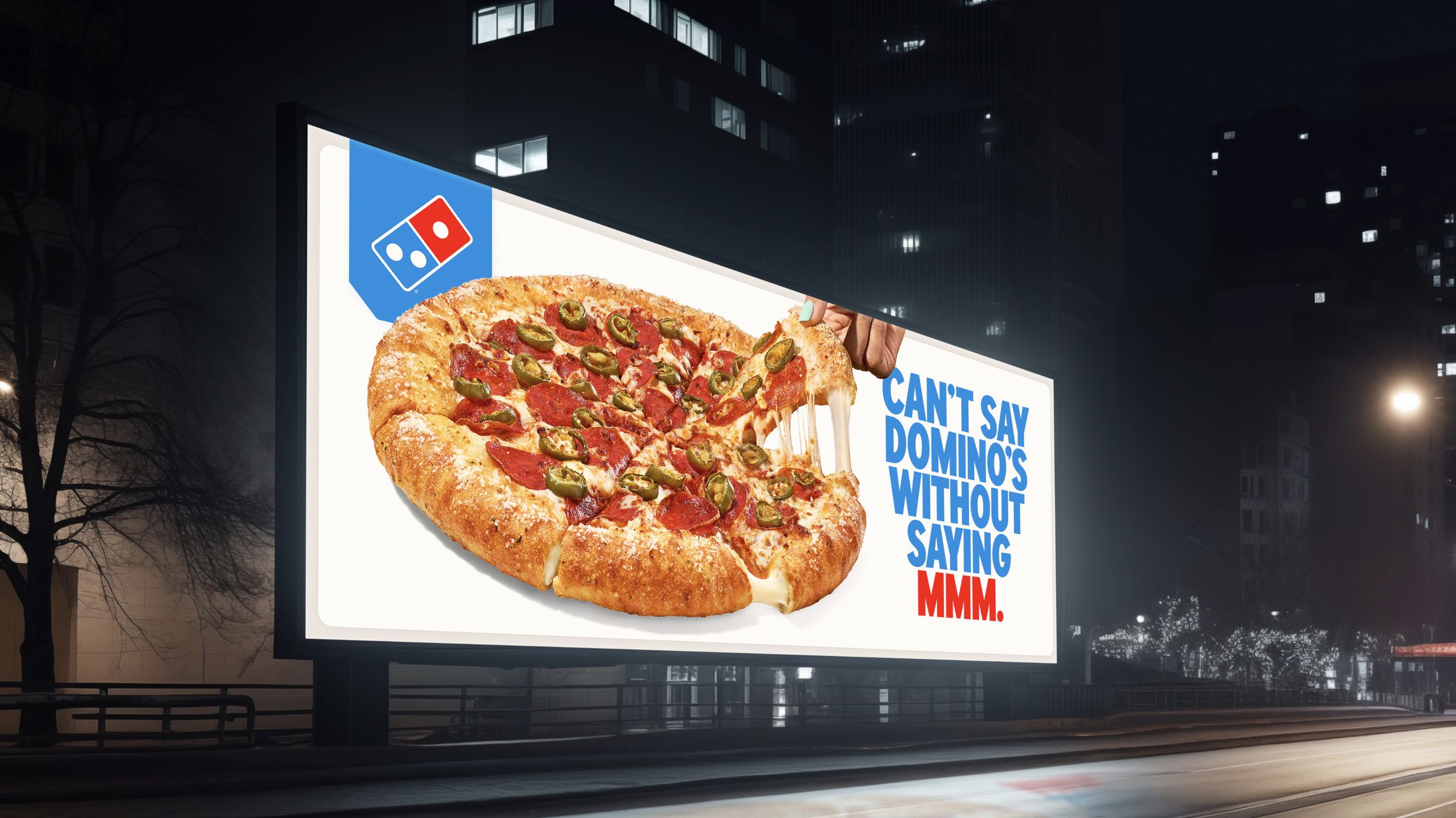
Our Must-Have Fonts for 2025 list was our most popular ever, but our must-have fonts for 2026 list aims to set the bar even higher. Finding the best typefaces among thousands can be pretty daunting! So, to make things easier, we've curated a list of outstanding must-have typefaces for the coming year. The ten font families in the list share something important in common - an explicitly human touch, not machine-made or prompt-produced, but born from human minds and crafted by human hands.