#web-design
#web-design
[ follow ]
#css #user-experience #accessibility #typography #user-interface #ux #svg #wordpress #web-development


fromCssence
2 months agoBreakpoints
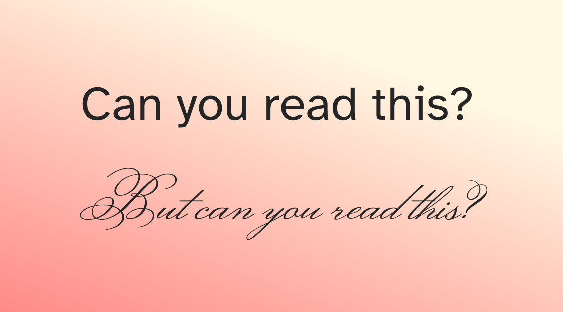
Using such a resolution in the web browser would render a tiny illegible desktop site. To avoid that, CSS pixels add a layer of abstraction. Initially the amount of actual pixels compared to CSS pixels was simply a 2x or 3x conversion, but these days fractional scaling is also common.
Web design


fromFast Company
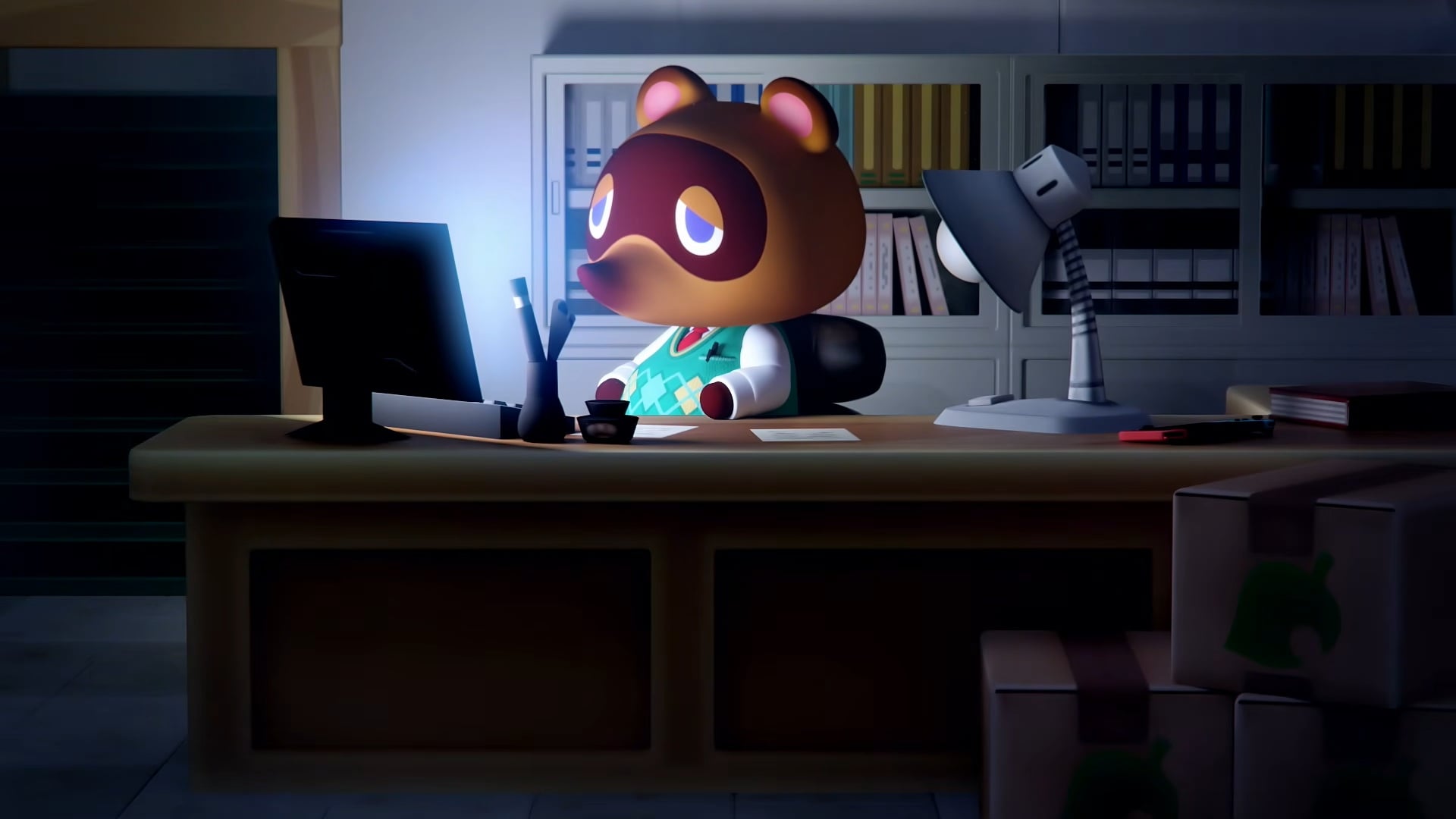
3 months agoTrump turned the White House website into a personal action hero reel
It replaces the old homepage-which featured a banner image of Trump, the bolded phrase "America is Back," and headshots of the first lady and vice president-with a decidedly more cinematic design. Now, when people visit whitehouse.gov, they're immediately greeted with a wall of videos, including shots of Trump sporting his own "Make America Great Again" merch, saluting military personnel, and taking off in a helicopter. Every shot is bathed in a warm, fuzzy filter, making the whole page feel like a retro-inspired movie trailer.
US politics
Typography
fromItsnicethat
3 months agoMaking publications into playgrounds for design: Madeline Montoya on the creative practices behind Byline and Bloomberg Businessweek
Madeline Montoya uses holistic, flexible brand and editorial design—combining type, motion, and web design—to turn publications into playful design experiences.

fromCNET
4 months agoBuilding a Website Doesn't Have to Be Hard. Here's How to Build a Wix Website, Without Learning a Line of Code
visual design editor allows you to build many types of websites without coding, but there's still plenty to learn before you start creating your site. I'll walk you through everything you need to know to build a Wix website, from how to choose a domain to some basic principles for writing your first blog post. I'll focus on building for-fun hobby sites, professional portfolios and service-based business websites, as Wix is most effective for these types of sites. If you're building an e-commerce website, I recommend using Squarespace or Shopify instead.
Web development
fromLogRocket Blog
5 months ago10 best hero section examples and what makes them effective - LogRocket Blog
A hero section is the first, visually prominent UI block at the top of a web page or digital product screen. Its job is to welcome users, present the product value at a glance, and effectively guide them to a desired primary action. It improves the first user impression with the product using a compelling headline, supporting copy, and CTAs (call-to-action), and other visual enhancements.
UX design
fromLondon Business News | Londonlovesbusiness.com
5 months agoWhy conversion-first web design is now a competitive advantage for London companies - London Business News | Londonlovesbusiness.com
London's business landscape has always been fiercely competitive. Whether you're a Shoreditch startup, a Mayfair consultancy, or a Croydon-based manufacturer, you're competing not just with neighbouring businesses but with companies across the UK and internationally. In this environment, your website isn't just a digital brochure - it's your hardest-working salesperson. Yet walk through most London business websites, and you'll find the same pattern: beautiful design, striking imagery, clever copy,
Web design
fromSpeckyboy Design Magazine
6 months agoShould Freelancers Advertise Their Pricing? - Speckyboy
Freelancers can choose their own business policies. We can determine how we work, when we work, and how much we charge. That last one can be difficult, to say the least. Pricing has confounded many a small business owner. Choosing what to charge for your service is only one part of the equation, however. You must also decide how to communicate those figures with others.
Web development
fromInc
6 months agoMeet the 2025 Power Partners in Creative & Branding
For your company and your products, your logo, packaging, and the impression you make via search engines and digital channels are the first things that clients and consumers will register. Controlling your brand image is linked to your success, and a polished professional look is vital. Design needs today aren't restricted to graphic design - they also include effective website and UX/UI design.
UX design
fromDefector
6 months agoOur Rich People Suck At Spending Money | Defector
I have to start with Bill Belichick. I promise I won't linger on that washed-up piece of driftwood for very long, but he serves as a useful, if minor, example. Here is Bill Belichick's official website. It's a terrible website. The design is so old that I half expected a pop-up alert telling me that I needed to download Flash. And the copy is so weak (example: "In 2000, Belichick led the Patriots to 20 winning seasons") that Belichick's weird-ass girlfriend probably wrote it herself.
National Football League
fromSmashing Magazine
6 months agoAmbient Animations In Web Design: Practical Applications (Part 2) - Smashing Magazine
Ambient animations are the kind of passive movements you might not notice at first. However, they bring a design to life in subtle ways. Elements might subtly transition between colours, move slowly, or gradually shift position. Elements can appear and disappear, change size, or they could rotate slowly, adding depth to a brand's personality. In Part 1, I illustrated the concept of ambient animations by recreating the cover of a Quick Draw McGraw comic book as a CSS/SVG animation.
UX design

fromSmashing Magazine
7 months agoAmbient Animations In Web Design: Principles And Implementation (Part 1) - Smashing Magazine
Creating motion can be tricky. Too much and it's distracting. Too little and a design feels flat. Ambient animations are the middle ground - subtle, slow-moving details that add atmosphere without stealing the show. Unlike timeline-based animations, which tell stories across a sequence of events, or interaction animations that are triggered when someone touches something, ambient animations are the kind of passive movements you might not notice at first. But, they make a design look alive in subtle ways.
Web design

fromCreative Bloq
8 months agoWhat we can learn from Taylor Swift's web design mistakes
While orange and green might make a fetching palette, it spells bad news for accessibility, meaning there's much to be learned from Ms Swift's design flaw. You can employ the best designers or opt for the best website builder, but without accessibility at the forefront of your design, you risk alienating a huge audience. By today's standards, aesthetics and accessibility need to work in tandem, and sadly, Taylor's website misses the mark.
Web design
Web design
fromLondon Business News | Londonlovesbusiness.com
8 months agoCreating compelling digital experiences: The art of web design in Manchester - London Business News | Londonlovesbusiness.com
Exceptional web design in Manchester must capture attention, build trust, and create digital experiences that drive conversions while reflecting diverse local industries and consumer expectations.
Artificial intelligence
fromSmashing Magazine
8 months agoThe Double-Edged Sustainability Sword Of AI In Web Design - Smashing Magazine
AI accelerates web design and optimizes code but increases energy consumption, requiring careful trade-offs between operational efficiency and the environmental impact of AI infrastructure.
fromCSS-Tricks
9 months agoBringing Back Parallax With Scroll-Driven CSS Animations | CSS-Tricks
Parallax is a design pattern where webpage elements move at different speeds during scrolling, creating a layered, three-dimensional effect. Initially reliant on JavaScript, a recent CSS-only method has emerged, allowing smoother, non-blocking animations.
Web development
fromSitePoint Forums | Web Development & Design Community
10 months agoHow to dimish unwanted CSS
When converting HTML to WordPress themes, excessive WordPress indices add numerous CSS classes that conflict with the original HTML layout and design, necessitating solutions to manage these classes.
Web development
[ Load more ]